Introduction
Boho—short for bohemian—began as a way of life among 19th-century creatives who valued artistic freedom over convention. Over time it blossomed into a recognizable aesthetic that prizes individuality, handcrafted details, and a joyful mix-and-match spirit. Among the many pillars of the look—pattern, texture, silhouette—color might be the most instantly defining. Earthy ochres, sun-washed neutrals, and jewel-bright accents signal “boho” before a single tassel or macramé knot comes into view. This article unpacks those signature hues, traces their cultural roots, and shows how to weave them gracefully into both wardrobes and living spaces.
1. Understanding the Boho Aesthetic
Boho style traces back to free-spirited artist enclaves in Paris and Prague, where painters and poets rejected strict dress codes in favor of romping silhouettes, global textiles, and nature-inspired pigments. As beatniks, hippies, and world travelers adopted the look, it absorbed influences from Moroccan souks, Indian bazaars, and Southwestern deserts. Color became the common language: rust for red-rock canyons, turquoise for Himalayan skies, indigo for West African shibori. Because the movement prizes self-expression over uniformity, no two boho palettes are identical; instead, each wearer or decorator curates hues that echo personal memories, landscapes, or cultural ties.
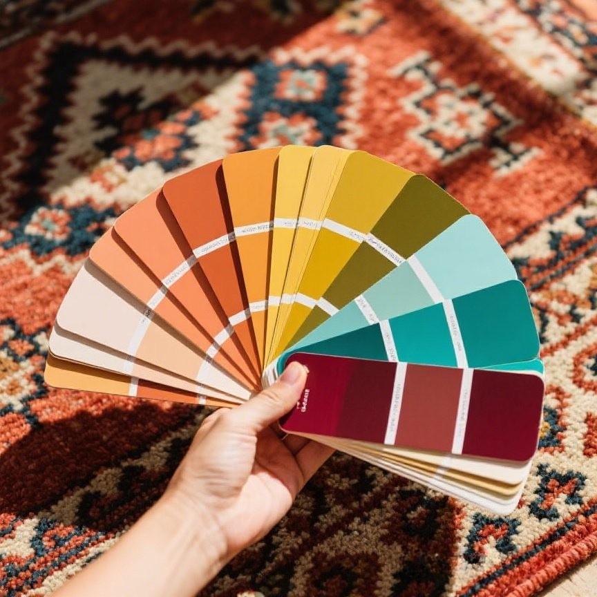
2. The Core Boho Color Palette
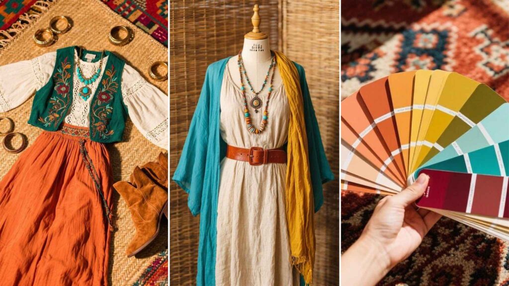
Boho colors group naturally into three families that balance and amplify one another:
Earth tones. Terracotta, sand, olive, rust, and mustard form the grounding layer. They mirror clay, soil, and sun-bleached grasses—elements familiar to nomads and artisans alike. These hues anchor busy patterns and let brighter accents shine without visual chaos.
Jewel tones. Turquoise, amethyst, deep ruby, and emerald inject vibrancy reminiscent of hand-cut gemstones and bazaar glassware. Often tucked into embroidery, beading, or a single statement wall, they punctuate earth tones the way lamp-light sparkles against dark wood.
Neutrals. Ivory, cream, soft gray, and warm beige keep the palette breathable. When layered through gauzy curtains or linen throws, they create negative space for the eye to rest—crucial in eclectic rooms or layered outfits.
Between these groups lies an almost infinite playground. A patchwork skirt might pair sienna with teal, while a living room rug could combine desert sand with ruby borders. The key is harmony, not matchiness; hues should feel gathered from journeys, not purchased as a set.
3. Symbolism Behind Boho Colors
Many boho hues draw directly from nature’s four classical elements. Rusty oranges and toasted browns symbolize earth, conveying stability and a handmade ethos. Sapphire blues and turquoise speak to water and sky, evoking clarity and wanderlust. Warm gold, marigold, and ember reds hint at fire, adding passion and evening-campfire intimacy. Meanwhile, sage and forest greens celebrate growth and healing, themes central to eco-minded bohemian lifestyles.
Cultural symbolism deepens their appeal. Turquoise is revered by Southwestern tribes as a protective stone; saffron carries sacred resonance in South Asia; and deep indigo has long denoted prestige in West Africa. Whether consciously cited or subconsciously felt, these associations lend emotional weight—calming, energizing, or grounding—as color washes across fabric or wall.
4. Mixing and Layering Boho Colors
Where minimalist palettes aim for strict coordination, boho thrives on playful layering. Think of a flea-market table: glazed ochre pottery beside a teal glass bottle, under a plum embroidered runner. The trick is to repeat undertones—warm with warm, cool with cool—so the medley feels deliberate. Texture intensifies color perception, too: chunky knits mute bright ochre to a cozy marigold, while glossy silk makes the same hue gleam like a sunrise.
When layering clothes, start with an earth-tone base (olive culottes, sand tee), then add a jewel-tone kimono or scarf. In interiors, anchor the largest surface—walls or rugs—in a subdued neutral, then scatter jewel-bright cushions and terracotta planters. Step back frequently; if one shade yells louder than the rest, balance it with its opposite on the color wheel or a fresh dose of soft cream.
5. Seasonal Variations in Boho Color Schemes
Despite its year-round free-spirit identity, boho color subtly shifts with the seasons:
- Autumn leans into rusty copper, burnt sienna, and deep mustard, echoing fallen leaves and harvest spices. Add weighty tweeds and corduroy to intensify warmth.
- Winter relaxes into cozy neutrals—oatmeal, dove gray, creamy white—punctuated by jewel-tone velvets. Candlelight glints off ruby cushions for a snug retreat.
- Spring revives the palette with dusty rose, sage, and pale apricot. Florals return on cotton maxis and quilted throws, lifting the mood like first blossoms.
- Summer goes bolder: zesty coral, sea-glass aqua, and sun-bleached ochre. Gauzy kaftans and hand-loomed hammocks make color ripple like seaside market stalls.
Each shift still feels unmistakably boho because the hues remain organic, sun-tempered, and layered—not slick or synthetic.
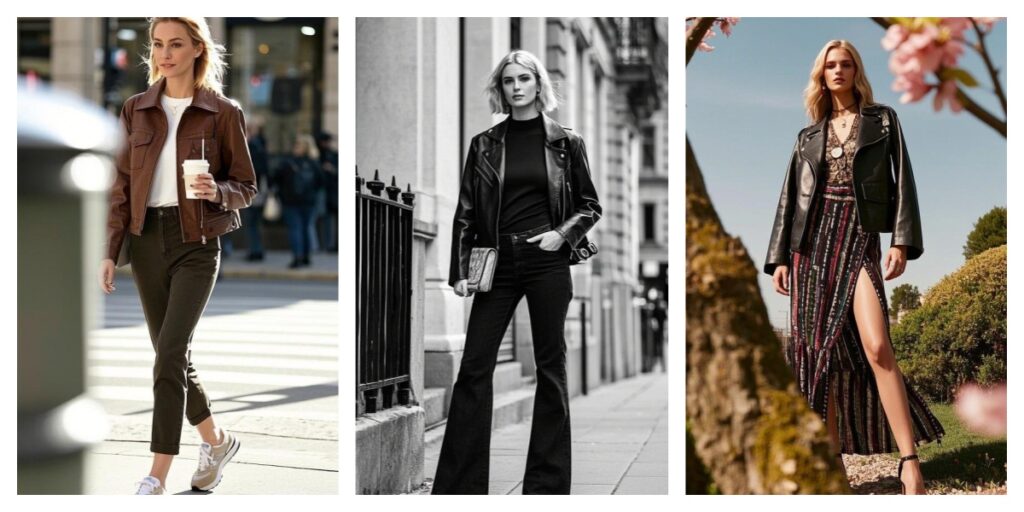
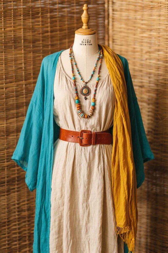
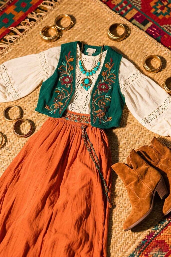
6. Using Boho Colors in Fashion
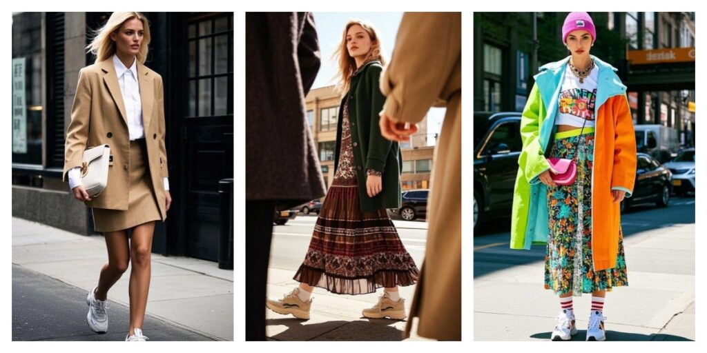
A quintessential boho outfit often starts with an earthy anchor—say, a terracotta maxi skirt—then layers in jewel-tone embroidery or patchwork. An olive utility jacket tossed over a cream lace dress balances rugged and romantic vibes, while a mustard crocheted crop top brightens denim culottes without forcing a head-to-toe palette change.
Accessories pull the spectrum together. Turquoise rings echo the threadwork on a tote; indigo batik bandanas tame sun-bleached hair; brass bangles add metallic glimmer that doubles as a neutral. Footwear, too, carries color: cinnamon-tan suede ankle boots ground vibrant prints, while embroidered espadrilles nudge ivory trousers toward festival flair. For beginners, pick two earthy tones and one jewel accent, then repeat that accent twice (earrings and scarf, for example) so it reads intentional rather than haphazard.
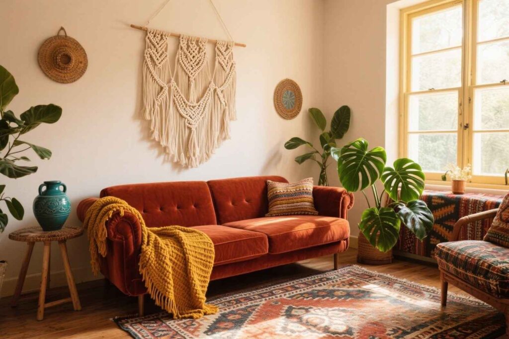
7. Applying Boho Colors in Interior Design
Walls set the emotional temperature. A pale clay pink behaves like a warm neutral, allowing teal vases and ruby kilim pillows to pop without feeling busy. Conversely, an accent wall in deep indigo pairs brilliantly with cream macramé hangings and mustard poufs, creating a reading nook that feels both cocooning and creative.
Textiles supply the rest of the story. Layer a vintage Beni Ourain rug (ivory and charcoal) beneath a rust velvet sofa, then sprinkle emerald velvet cushions and a plum toss for gem-like highlights. Throws in chunky oatmeal wool temper the brilliance, while olive-leaf houseplants bridge warm and cool halves of the palette. Lighting matters: amber glass pendants intensify earthy reds, whereas daylight streaming through gauze curtains cools the space and lets turquoise accents breathe.
8. Modern Twists on Traditional Boho Palettes
Contemporary designers are stretching boho’s palette in bold directions. Metallics—especially antiqued gold and matte copper—now mingle with adobe tones to elevate casual spaces into boho-chic lounges. Black, once thought too stark, outlines rattan mirrors and iron bedframes, giving visual punctuation that helps airy schemes look intentional. Neon pink piping on a camel pillow or citron tassels on an indigo curtain inject a playful jolt reminiscent of street-art energy.
Minimalist interpretations keep only the earthy base and one accent, stripping pattern but keeping texture: think sand-colored linen drapes, a single oversized ruby floor cushion, and a desert-sun photograph. Meanwhile, eco-conscious decorators swap chemical dyes for plant-based pigments, yielding subtler but deeply nuanced shades of walnut brown or pomegranate red. What remains constant is boho’s open invitation to curate and evolve—your palette can honor tradition while still feeling utterly current.
Conclusion
Color is the heartbeat of boho style, weaving stories of distant landscapes, artisan workshops, and personal wanderings into every thread and brushstroke. Whether you lean toward grounded terracotta or effervescent turquoise, these hues let you proclaim individuality without uttering a word. Experiment, trust your eye, and mix boldly—because in the world of boho colors, the most authentic palette is the one that feels like home to you.